The Nintendo Switch has just turned four years old. But while the continued popularity of the console is something to be celebrated, there’s one aspect of the Switch common to all players that is in desperate need of improvement. I speak, of course, of the eShop.
The Switch eShop is the gateway to a world of wonderful, varied and thrilling games currently available on the Switch hardware. While the console doesn’t quite have the power of a PS5 or Xbox Series X, it’s still become a home for AAA and indie games alike (even if the former usually takes something of a hit to graphics quality).
However, finding the Switch games you actually want to play is far more difficult than it needs to be, turning the awe-inspiring act of discovery into a continual chore. And while it’s possible to purchase games online through a phone or laptop, it’s hard to avoid this troubled portal when playing on the go with some measure of spontaneity.
Many Switch games are only available through digital downloads, too, and physical cartridges aren’t a great idea for those trying to reduce the footprint of their purchases, or access new games at the point at which they order them.
So what’s so broken about the Nintendo Switch eShop, and how could Nintendo fix it? Here is our exhaustive list of complaints.
Slow loading speeds and bad navigation
The step-by-step experience of using the eShop is, well, a slog. Each menu takes two-to-three seconds to load, with a stuttering 8-bit animation of Mario pathetically papering over the cracks.
Sometimes the animation varies – it was briefly replaced with a more modern ‘cat Mario’ animation – and some more direct engagement from Nintendo to highlight ‘of the moment’ games with this would, at the very least, make it more interesting to look at. (If Twitter can embrace customized emojis for big game and console releases, why can’t Nintendo do the same here?) But the underlying problem is the loading speed of the eShop, which trips and stumbles like an early ‘00s web page.
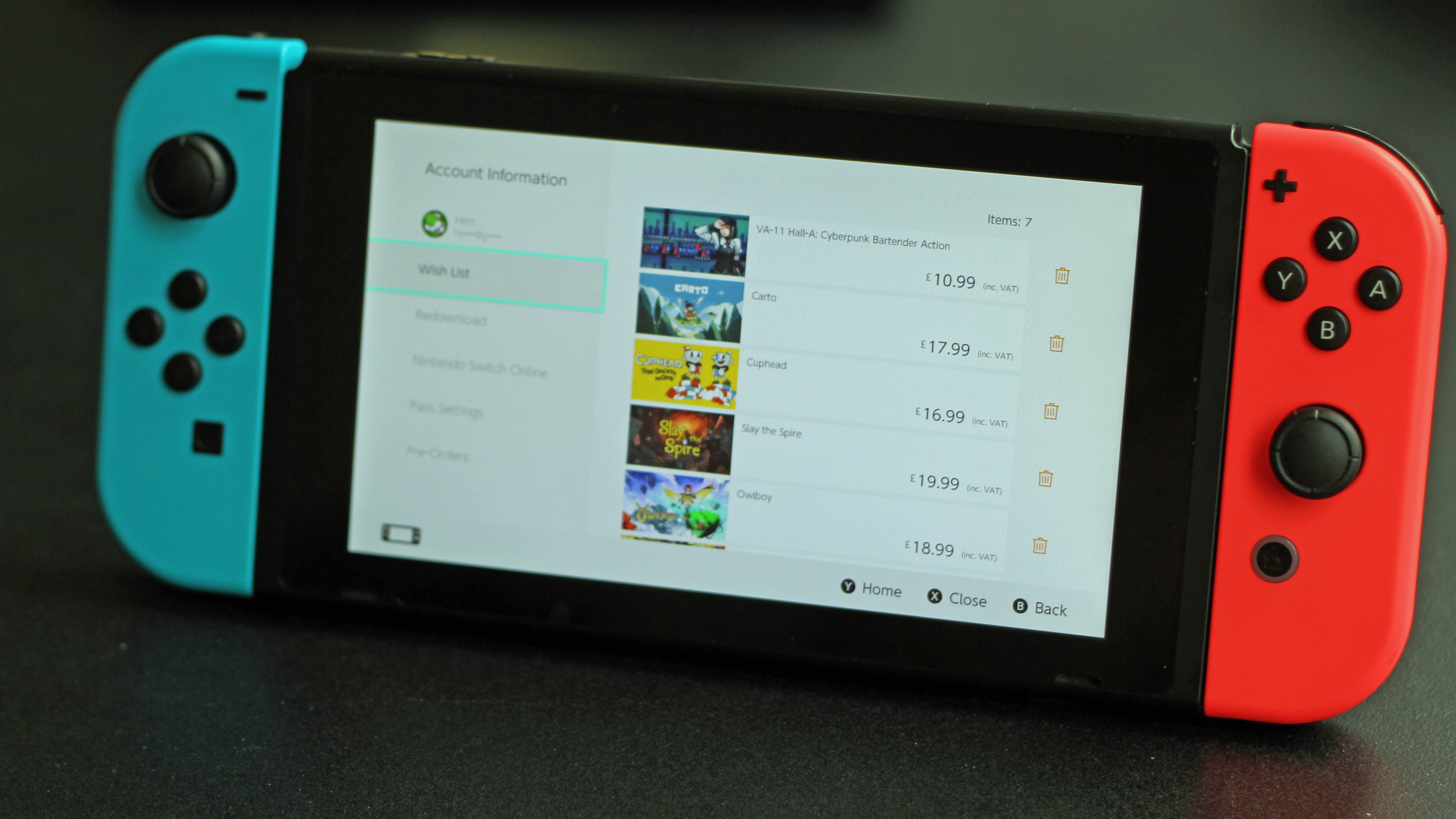
The slow speed would be easier to accept if it wasn’t for the navigational issues of the eShop. For one, the wishlist of your favorited games – added by clicking on a little heart when browsing a particular game – is hidden away in your account settings, only accessible by selecting your user icon in the top right corner of the eShop.
It’s a very unintuitive place for a list of a player’s most desired games, which should be front and center in the marketplace, in order to encourage purchases as well as remind players of what they’ve been interested in before.
Muddled search
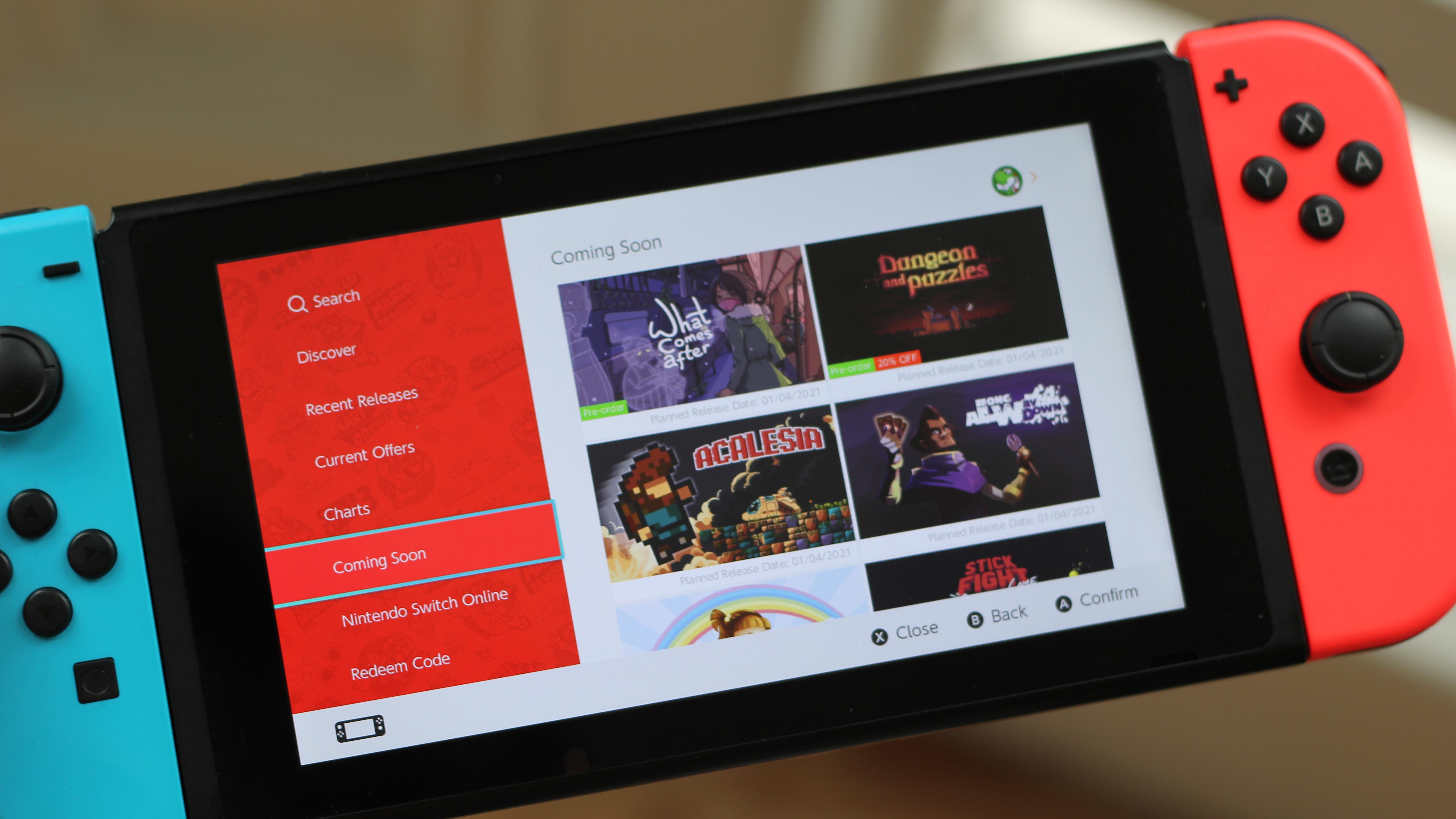
The eShop is, however, more concerned with broader selection criteria than individually-chosen games. You can search for games in a few, very limited ways: by inputting a game’s specific title, looking at the charts for the biggest sellers, checking out discounted titles, eyeing up soon-to-launch games, or browsing the ‘Discover’ tab for a mix of new and highlighted games.
Discover was added in mid-2018, in an attempt to better showcase titles that weren’t getting warranted exposure through the other overviews on the eShop. It isn’t curated according to your own tastes and previous purchases, though, and confusingly lists two separate titles as ‘Game of the day’, giving a muddled feel from the off. Demos are sprinkled through this page rather than getting their own dedicated overview too, and the continued bloating of the Switch library with new games has shown Discover to be little better than a sticking plaster on a bursting pipe, with countless titles falling through the cracks.
Inputting game names manually is usually a surefire way to find something, and high-profile titles will come up in an auto-suggestion feature, but its usefulness is limited. Typing in ‘Holl’ will suggest ‘Hollow Knight’, but also ‘Hollywood’ and ‘Holland’. Selecting that final option doesn’t come up with any entries at all, suggesting that Nintendo is using an external data set as a reference point rather than the names of Switch games themselves.
The basic search function does allow you to filter by genre, but it’s not an altogether pleasant experience. The eShop’s vague preset categories aren’t overly helpful for pinning down games you’ll be interested in, as shown by how broadly these terms are used.
In the ‘Action’ row, you’ll find the action RPG Monster Hunter Rise alongside sandbox game Minecraft. In the ‘Adventure’ row, you’ll find Grecian mythology roguelike Hades… alongside Minecraft. The side-scrolling Cuphead shows up high in the list for ‘Shooter’, but not ‘Platformer’. Various titles repeat across genres, suggesting they were so loosely tagged as for each tag to be somewhat pointless. What’s the point of a filter if a game shows up for each one?
Searching via any genre also prioritizes the listing of free downloads over paid games – an odd judgement call both for a money-making console maker and for players who haven’t specified they’re after free content (a ‘free games’ tab, like the ‘free’ menu on Amazon Prime Video, would be a boon here). There is a breakdown of ‘Content Types’, which breaks down into Software (you know, all the games) and Downloadable Content – as if you would be searching for DLC for a game you have yet to buy.
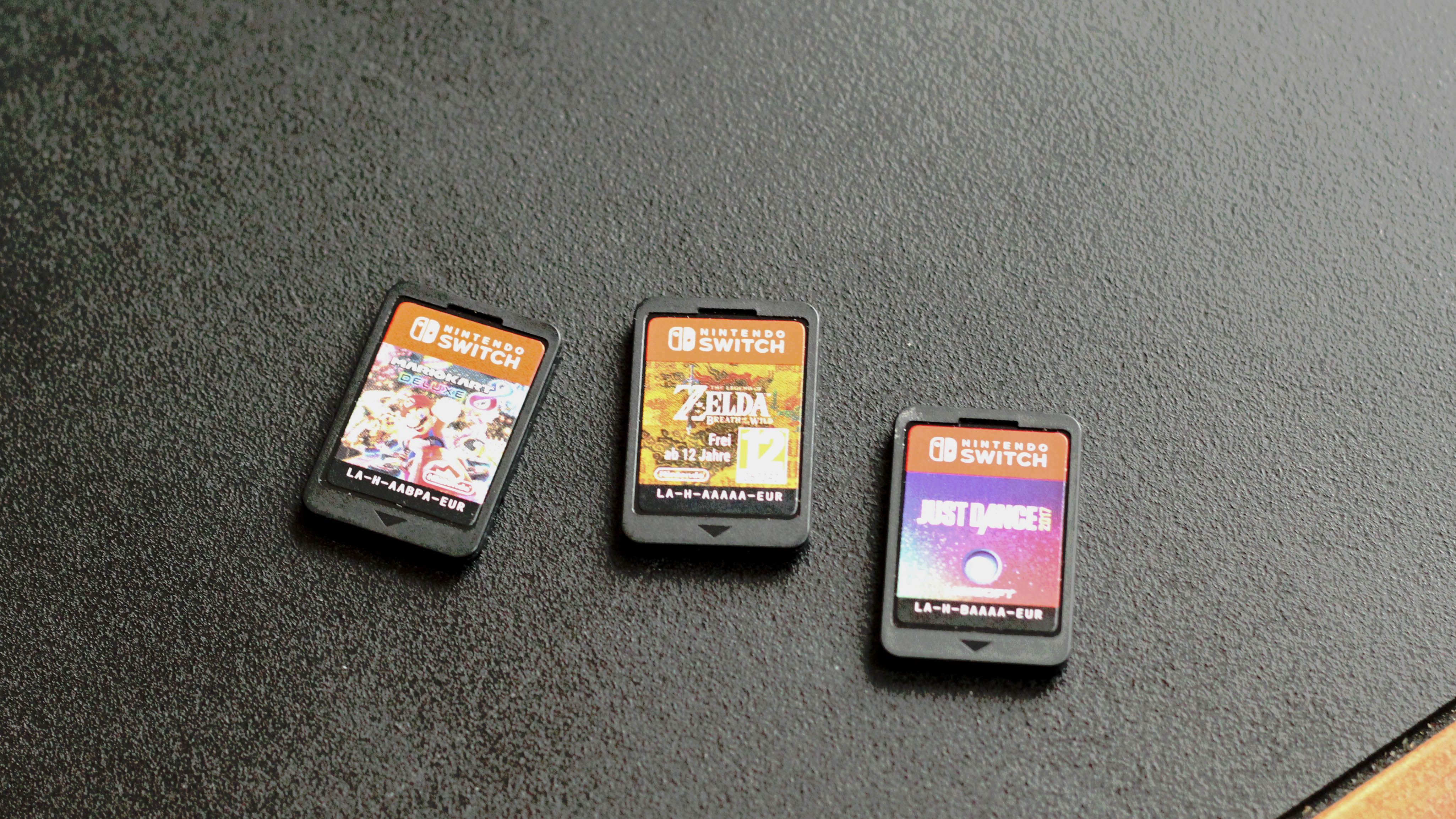
And, aside from the sales chart, there’s no way of searching through long-term popularity of titles past the current hot sellers, or being introduced to quality titles that might fit your interests based on the games you’ve already bought, played, or physically inserted via cartridge.
Learning from the past
The dumbest thing about the Nintendo Switch eShop is this inability to learn from your purchases – and while a good algorithm like that used by Netflix may be complex to put together, even a basic assessment of the usual price, genre, or recurring publisher / franchise you opt for would be a very helpful starting point. If I’ve sunk 40+ hours into Hollow Knight, I want the eShop to show me when Silksong is available to pre-order. If I haven’t picked up Breath of the Wild in a few months or years, I want the eShop to suggest Hyrule Warriors ahead of the BOTW 2 sequel. And so on.
In my personal experience, I’ve also found these content screens only partially responsive when scrolling with the touchscreen, which is an odd blind spot on Nintendo’s behalf. Of course, if we’re talking input issues, ongoing reports of Joy-Con drift are far more concerning, but it’s disappointing to be scrolling through potential new games and see the screen shudder to a stop without warning. What gives?
You also can’t take screenshots of the eShop, which is a curious restriction, and one that made getting images for this piece a bit difficult. Strike three, Nintendo.
The way forward
There is, without a doubt, plenty of amazing Nintendo Switch games out there – when you can find them – and the wizardry of a handheld gaming machine that doubles as a home console makes many of these issues seem insignificant by comparison.
But Nintendo has a hold on the gaming market, and is raking in millions of console sales, and it’s about time the eShop software got the same attention and innovative thinking that spawned the Switch in the first place. The Epic Games Store launched well after the eShop, in late 2018, and is able to run temporary content categories, like BAFTA-winning games, at certain times of the year – but where is this dynamic curation on the Switch?
As it is, the excellent Switch games out there aren’t always easy to find, and it’s something that affects players and developers alike.
With rumors of a Nintendo Switch 2 iteration doing the rounds, it could be that Nintendo uses a new console launch as an opportunity to overhaul its games marketplace, making it a sleeker, faster, and smarter version than it is now. Until then, you’ll find me buying Switch games on my laptop instead.
- Best Nintendo Switch games you need to play
from TechRadar - All the latest technology news https://ift.tt/3ud3MIW
